


.png?width=200&height=148&name=Menu%20C%20(2).png)

.png?width=307&height=228&name=Menu%20-%20D%20(1).png)

.png)

This article is an excerpt from our new ebook: State of Indoor Air Quality in 2023: Market Landscape, Trends and Opportunities, and Global Data Benchmarks. Want to read the 49-page document? Download it for free.
How does the air quality in your building compare to industry peers?
One way to answer this question is by looking at indoor air quality standards; but it’s also useful to look at the actual data collected in our indoor environments. Kaiterra’s air quality monitors are installed in thousands of commercial buildings, universities, and other indoor spaces around the world. This gives us unique insight into the state of air quality in different settings and locales.
Below you will find a summary based on anonymized readings from a small selection of Kaiterra monitors worldwide. Over 8 billion data points were analyzed between the 1st of January and the 31st of December 2022. Only data points on weekdays and during operating hours are used (read more about data selection and coverage in the Methodology section).
We will use this data to try and answer the questions:
- What levels of pollutants were measured in indoor environments?
- What are risk areas when it comes to indoor air pollution?
- For what percentage of the time were IAQ levels at healthy levels?
- How do seasonal and regional patterns affect indoor air quality?
- How does occupancy impact indoor air quality throughout the day?
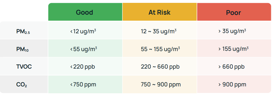
Color Coding and Benchmark Levels Used
We rate IAQ metrics based on industry standards and key building certifications such as WELL and RESET. Below is a breakdown of the levels used for each metric:
Pollutant Levels in Different Regions: Average, Median, and 90th Percentile Comparison
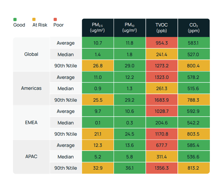
Note: The median and 90th percentile are useful measures for analyzing large datasets. The median represents the middle value where half the data is below it, and the 90th percentile represents a value below which 90% of the data falls.
These metrics can be especially useful in analyzing indoor air quality, as they provide a more accurate representation of the distribution of pollutant levels, including any high spikes in the data, which the average might not capture.
For example, TVOC levels can have sudden and significant increases that can impact air quality, but the average may not fully reflect this. By using the 90th percentile value, you can get a better understanding of the distribution of TVOC levels and identify areas or times when the air quality is not optimal.
Key Findings
- Overall, all regions performed reasonably well on most metrics - although it’s worth remembering that these readings are taken from Kaiterra clients, who are predisposed to be more concerned about air quality than the ‘average’ building operator.
- All regions have healthy levels of CO2, indicating good ventilation. Americas performed the best with the lowest average, median, and 90th percentile levels.
- TVOC is the main concern. Average levels of VOCs fell within the “Poor” range in all regions, with the highest average data measured in the Americas.
- APAC experienced most issues with indoor PM2.5. Average measured levels would meet the precondition requirements for WELL certification and pass the Acceptable level for RESET certification, but would not meet the optimization requirements for WELL or pass the High Performance level for RESET.
- Temperature and humidity both fell within the acceptable and recommended ranges for optimal occupant health and comfort.
Global and Regional Distribution - Percentage of Time Where Air Quality was Good, at Risk, or Poor
Average and median data may offer a general overview of the air quality in a space, but it may not provide enough detail for building operators and facility management teams to grasp the performance of the space.
To dive deeper into the data, we analyzed the percentage of time throughout the entire year in which measured air quality was good, at risk, or poor.
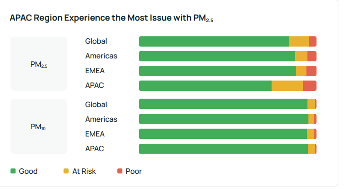
The APAC region experiences the greatest challenges with particulate matter, with PM2.5 levels falling within the "Good" range only 74.4% of the time. This is significantly lower than the Americas (87.5%) and EMEA (88.2%). A concerning 17.9% of the time, PM2.5 levels were found to be "At Risk."
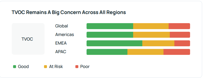
High levels of TVOC are a concern globally, with only 46.2% of all hours in the “Good” range. TVOC levels are particularly high in APAC, with 25.7% of the time in the “Poor” range.
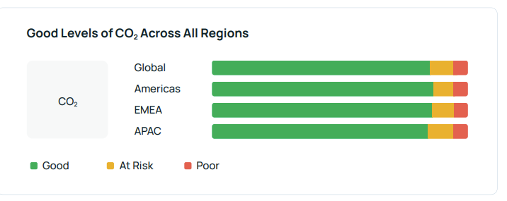
Globally, CO2 levels were within the "Good" range for 86% of the time. The APAC region performed relatively poorly, with nearly 10% of the time spent in the "At risk" range.
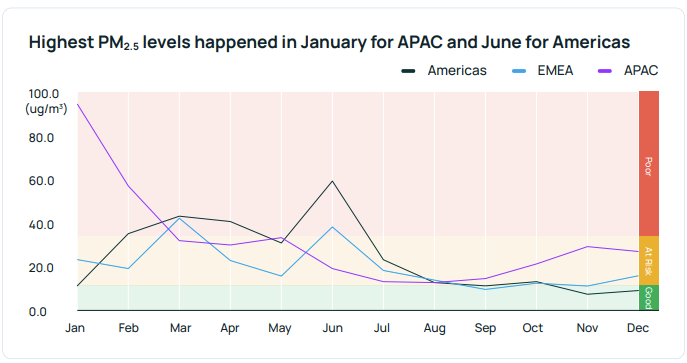
Dive into Particulate Matter - Monthly Breakdowns
Another interesting way to look at the data is to break it down month-by-month to help identify seasonal and regional trends. This is particularly helpful when analyzing particulate matter, as the level of particulate matter indoors can be heavily impacted by outdoor pollution level.
Below is a graph showing the 90th percentile data for PM2.5 in each month across three regions. Global data is removed here to focus on the regional differences.
We chose the 90th percentile data because it provides a clearer understanding of the distribution of pollutant levels and gives a more comprehensive picture of the air quality during the measurement period.
Key Findings
- APAC has high levels of PM2.5 in January and February, possibly due to higher levels of outdoor pollution due to these months. The level in APAC during January is nearly 8 times higher than the levels in the Americas at the same time.
- Americas suffer from high PM2.5 in February, March, April, and June.
- EMEA has the fewest and lowest peaks for PM2.5 throughout the year.
Daily CO2 And Ventilation Patterns
To get a sense of how indoor air quality changes throughout the workday, we plotted all the data points on a 24-hour timeline based on the corresponding time zones and only included those that occurred during or close to typical business hours.
In our analysis, we focused on CO2 levels, which are influenced by both ventilation and the number of people present. This is why CO2 is often used as a measure of ventilation efficiency. Similar to the section above, the 90th percentile data is used here to provide a better picture.
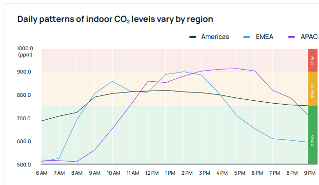
Key Findings
- Globally, the 90th percentile CO2 levels throughout the working day were mostly within the “Good” and “At risk” ranges. However a clear daily pattern and regional differences exist.
- In the Americas, CO2 readings are higher from 10 AM to 3 PM with a peak at 1 PM. The increase is only 150 ppm at the peak compared to 6 AM and CO2 levels are stable throughout the day.
- In EMEA, CO2 levels peak at around 10 AM and 2 PM. It’s also worth noting that the increase happens at 7 AM, much earlier compared to other regions.
- In APAC, CO2 levels don’t rise until after 9 AM and reach the first peak at 12 PM. The levels remain elevated and even reach the "Poor" range of 900+ ppm from 3 PM to 6 PM. There is a 400 ppm increase during peak hours compared to the start of the work day, indicating greater crowding or more frequent use of spaces.
Making Sense of the Results
As mentioned above, the quality of indoor air measured by Kaiterra is likely better than the average building as these readings are from our database – meaning they are gathered from buildings and spaces that care about IAQ and are willing to invest in an IAQ monitoring system. However, several interesting findings emerge when looking at this cohort:
Indoor air quality can still be improved, even in spaces that prioritize it.
Through this analysis, we’ve identified areas of improvements for each region, such as high TVOC readings globally, high PM2.5 readings in APAC, as well as a potential risk of high CO2 readings in APAC.
There is no one-size-fit-all approach for IAQ.
Different regions face unique challenges. Global companies should recognize regional and seasonal differences and implement tailored strategies instead of a universal protocol.
Occupancy levels affect indoor air quality.
Increased occupancy can lead to higher CO2 levels if ventilation rates do not keep pace. It is important to take a dynamic and performance-based approach to ventilation to avoid both unhealthy conditions and energy waste.
A deeper analysis of IAQ data is necessary for a full understanding.
Relying solely on simple statistics such as average and median may not provide a complete picture, but additional measures like distribution analysis can provide further insights. The IAQ Distribution Report used in Global and Regional Distribution is a key feature of the Kaiterra Dashboard.
Finally, it’s important to remember that aggregated data will always tell a partial story. The regional and seasonal trends here can be used as reference but may not be representative of what your building is experiencing.
To truly understand how your space is performing, it's best to have a personalized monitoring strategy in place. With access to more detailed information such as the space size, type, air handling unit, and floor plans, it becomes possible to understand the root cause of issues, and to take the optimal corrective actions to create a healthier indoor environment.
Next Steps:
- Read our previous article on the shift from data-informed to data-driven decision making when interpreting IAQ data
- Download a free copy of the full ebook for additional data, benchmarks, and insights
- Talk to a Kaiterra solutions expert about continuous monitoring in your organization