.png?width=200&height=148&name=Menu%20C%20(2).png)

.png?width=307&height=228&name=Menu%20-%20D%20(1).png)

.png)

Data is useless without action. But to use data meaningfully, it needs to be available and understandable by the people making decisions. Effective analysis and visualization tools are essential.
When it comes to indoor air quality (IAQ), businesses want to use the data they collect in order to improve productivity and wellbeing. With that data now readily available through the use of commercial air quality monitors, software has become a central differentiator between different IAQ solutions. Below we look at the different types of IAQ dashboards, the essential features to look for, and the direction the market is headed.
What is an IAQ Dashboard?
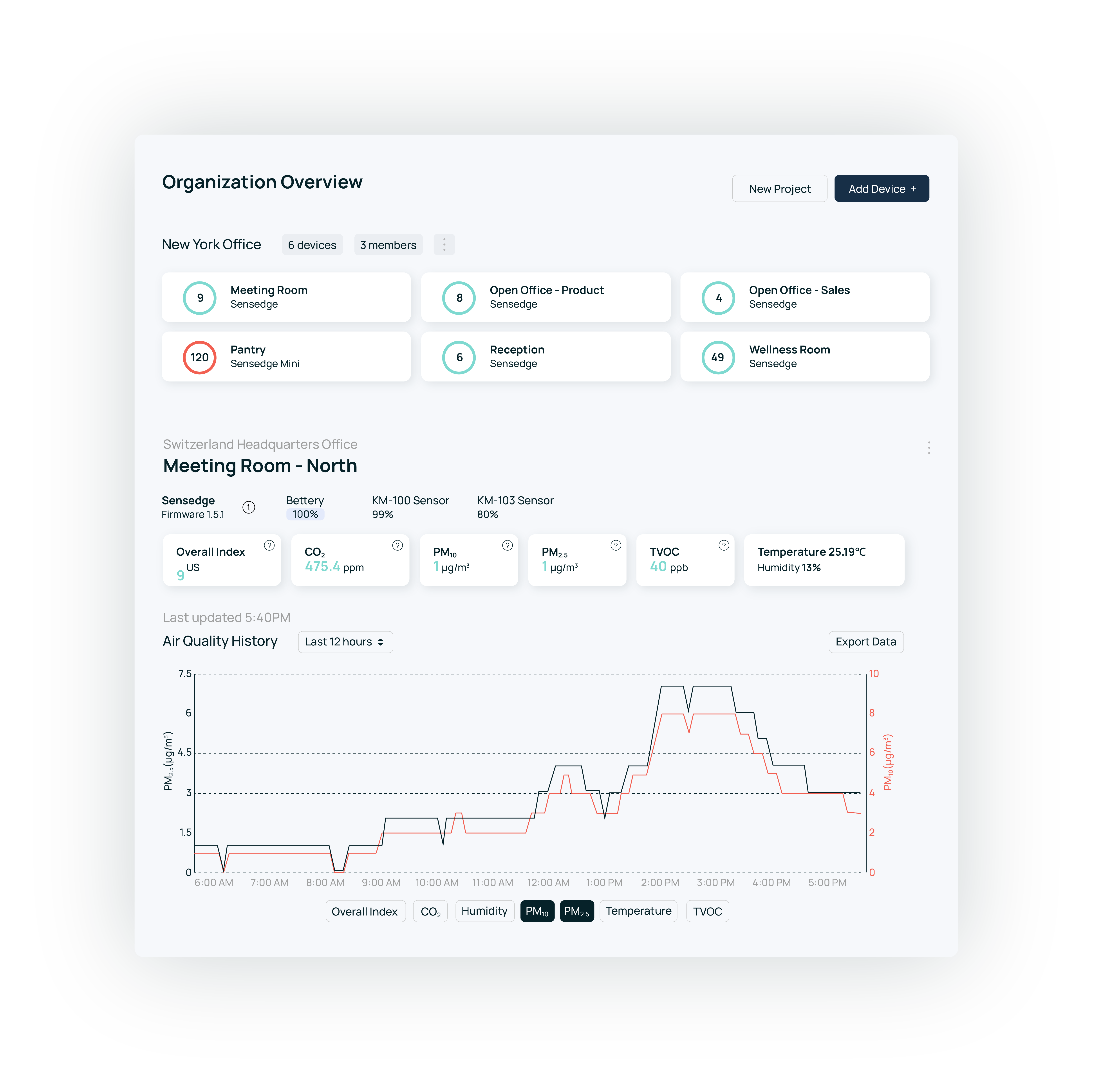
An indoor air quality dashboard is software used to analyze and present data from air quality monitors. These devices are equipped with various sensors to track IAQ parameters such as carbon dioxide, volatile organic compounds, particulate matter, and thermal comfort. The dashboard allows business stakeholders to see the data online, in real-time, as well as analyze trends over time, identify issues that need attention, and find patterns and correlations in the data.
(There would typically be an intermediary storage layer between the IoT sensors and the dashboard, such as a cloud database where the raw data is stored and processed - for our purposes we will treat this as part of the overall IAQ dashboard solution.)
The primary goal of an air quality dashboard is to inform decision-makers about the quality of air within a given space, enabling them to make data-driven choices in order to improve the indoor environment. In some cases the dashboards would be shared more broadly with occupants, either through an online portal or by displaying it on TV monitors placed in the building.
Not All Dashboards Are Created Equal
Any enterprise-grade IAQ monitoring solution will provide some kind of online dashboard. (If it doesn’t, run for the hills.) But there is a huge degree of variance in the breadth of functionality, the user experience, and the value different dashboard tools provide. When evaluating solutions, it's helpful to understand these key differences and limitations.
In most cases, an IAQ dashboard will be a simple reporting tool, providing some very basic pre-defined metrics with nicer visuals. It’s basically a pretty web portal where you’re able to see sensor readings. In the best case there will be a few charts showing you a headline figure over time (e.g., average CO2 levels). For anything more than that, you’ll need to export the data and use your own analytics tools.
Businesses need actionable information, not raw data
Data collection technologies have evolved, as has the scientific understanding of how to monitor air quality in an indoor space. Consequently, IAQ projects have become more complex, with more sensors collecting more data. Business users find they lack the required context to make sense of the information they see in these dashboards, and even more so - to actually reach a decision based on the data.
For instance, a facility manager may see a spike in TVOC levels during certain hours of the day. Is this an incident or a false alarm? Even a person wearing perfume can trigger a temporary spike; but if it lingers over time or repeatedly appears it could indicate an actual problem that should be investigated and mitigated (for example, new materials or cleaning procedures could have been introduced, which increase TVOC levels). The single reading is a barely-useful data point without the context and the bigger picture: How many devices are seeing these rises? What is the temporal or spacial pattern? For what percent of the time is this metric out of the normal range?
Yes, exporting the data is an option. But most business users lack the time, bandwidth, or knowledge to effectively work with the raw readings - which quickly accumulate into large volumes of semi-structured data (in other words, not something you solve with an Excel spreadsheet and some good intentions).
Today, the expectation is that IAQ dashboards should do more than merely display and allow users to export data. They should create value by making data digestible and understandable, and provide the essential context required for stakeholders to make informed decisions. Modern IAQ solutions - and yes, this includes Kaiterra - achieve this by incorporating deeper contextual data, more advanced analytics, and an API-first design.
How can you tell which category a specific IAQ dashboard falls into? The next sections offer some tips.
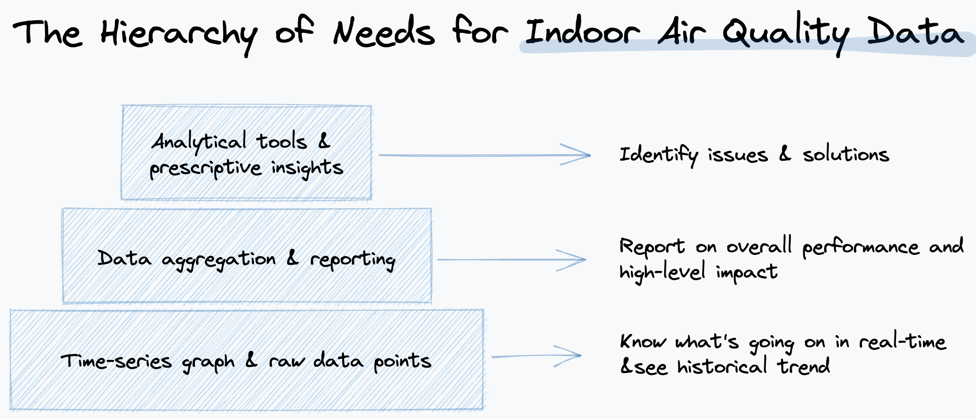
Three Levels of Functionality in IAQ Dashboards
When evaluating IAQ dashboards, it is helpful to consider them in terms of three distinct levels of functionality. Each level builds upon the previous one, offering increasingly sophisticated features that enable users to do more with the IAQ data that the business is collecting.
1. The basics: viewing and exporting data
At the most basic level, IAQ dashboards should enable users to view and export data collected from air quality sensors. This is the 'table stakes' functionality that allows facility managers and operations professionals to access the raw information generated by the hardware they have installed. While this level of functionality provides a foundation for understanding indoor air quality, it does not offer deeper insights or facilitate decision-making.
2. Giving context to data through aggregations and geospatial metadata
Beyond just displaying data, a dashboard can incorporate aggregations and metadata that give context to the sensor readings. At this level, the dashboard not only displays the basic time series but also provides additional information such as the location of monitors (e.g., meeting rooms, open spaces) and ways to summarize the data (e.g., air quality analysis in specific areas or during specific times of the week).
For example, this type of dashboard might let you see and compare performance based on HVAC zone, floor, building, space type, working hours, or floor map, hinting at specific problems that need to be addressed. This makes it easier for users to identify trends and patterns, leading to a more nuanced understanding of indoor air quality across different spaces and times.
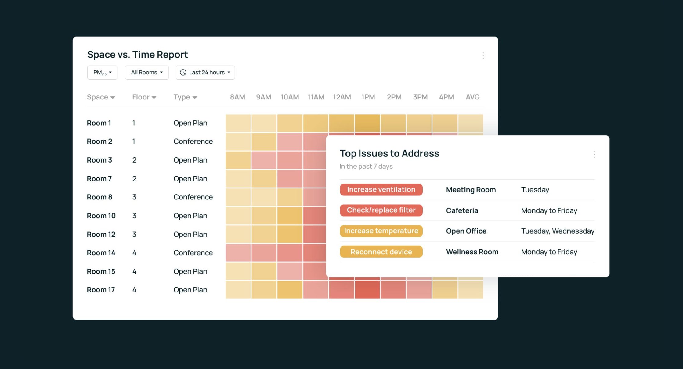
3. Driving action through interactive reporting and insights
More advanced IAQ dashboards offer rich reporting features and guide users toward actionable insights. At this level, the dashboard not only presents data and context but also actively guides users toward informed decision-making. These dashboards allow users to shift between high-level trends and granular details, highlight potential problem areas, incorporate data from additional sources such as occupancy systems and ambient air quality levels, and offer suggestions on how to optimize air quality within a given
space.
One way to make data more actionable is through pre-built templates. Since patterns repeat across different projects, an IAQ dashboard can provide tailored reports based on user role, type of building certification, or the type of indoor environment (co-working space, school, etc.)
An example of how this might play out in practice
Imagine a large office building with several meeting rooms, open workspaces, and a cafeteria. Using a basic IAQ dashboard, the facility manager can see rising CO2 levels in various devices but struggles to identify specific trends or causes of fluctuations. They may make a generic decision, such as increasing the overall ventilation rate in the building, which may not fully address the issue and could result in increased energy consumption.
With more advanced analytical capabilities, the facility manager could see data aggregated by time of day, day of the week, and location. They may notice that CO2 levels spike in meeting rooms during afternoon hours and are consistently high in the cafeteria. This additional context helps them identify specific areas for improvement and tailor their decisions accordingly, such as adjusting the ventilation in the meeting rooms during peak hours and improving the air circulation in the cafeteria.
But why stop there? The dashboard may highlight that the increased CO2 levels in meeting rooms correlate with high occupancy, and the cafeteria area is also suffering from elevated levels of PM2.5 together with the CO2 spikes during meal times.
In this case, besides simply improving ventilation for these spaces, you can also look into adjusting your meeting booking system or policy to prevent crowding, adding more shared working space for collaboration, introducing portable air purifiers in the cafeteria, and even considering other alternatives for your food program. These targeted, data-driven actions ultimately result in a more effective and efficient solution to improve indoor air quality while minimizing energy consumption.
Essential Features Checklist for IAQ Dashboards
Use this handy checklist to compare IAQ dashboards based on the key features.
- Ability to view data: Does the dashboard provide a user-friendly interface to view data collected from air quality sensors? Does it present the information in a clear and organized manner?
- Ability to export data: Does the dashboard allow you to export raw data for further analysis? How difficult is it to integrate with other tools and systems?
- Contextual data enrichment: Does the dashboard support easy integration and labeling of geospatial data, such as time zones and monitor locations? Can you add context to the collected data to help draw conclusions from it?
- Self-service features: Does the dashboard offer analytics tools that enable you to create customized data visualizations and reports focused on the metrics you care about?
- Reporting: Can you share a summarized report with different stakeholders easily? Can you automate ESG reporting or green building certification reports?
- Scaling to larger projects and multiple buildings: Can your dashboard accommodate multiple buildings and projects? Does it facilitate comparisons and offer insights across different locations?
- Large-scale data analysis: Will your dashboard be able to handle larger volumes of data? Will performance be impacted? Will there be additional costs for data retention?
- Enterprise management capabilities: Does your IAQ dashboard provide a secure, enterprise-ready platform? Does it support features such as single sign-on (SSO) and data residency requirements?
- User permissions management: Does your dashboard provide different levels of access control? Can administrators grant or restrict access to data and features for different team members based on their roles?
- Robust API: Does your dashboard offer a robust API that enables seamless integration with other tools, systems, or building automation systems?
The Future of IAQ Data: Self-Service Analytics
We’ve talked before about the need for more actionable IAQ data. We see this manifesting in more accessible, customizable, and user-friendly dashboards. Our vision is centered around self-service analytics that empowers users to create their own dashboards with the exact features and visualizations they need.
To learn more about the air quality dashboards used at the world’s largest and most innovative companies, check out the Kaiterra Dashboard. To see an up-close and personal demo of how it works, get in touch with our team today: